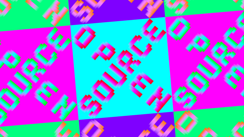
Logo for a cross-European open source software initiative.
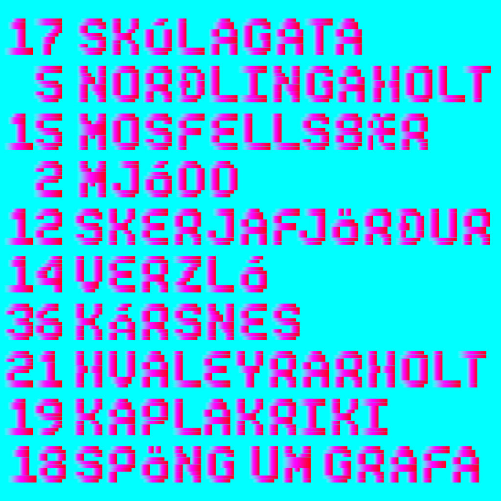
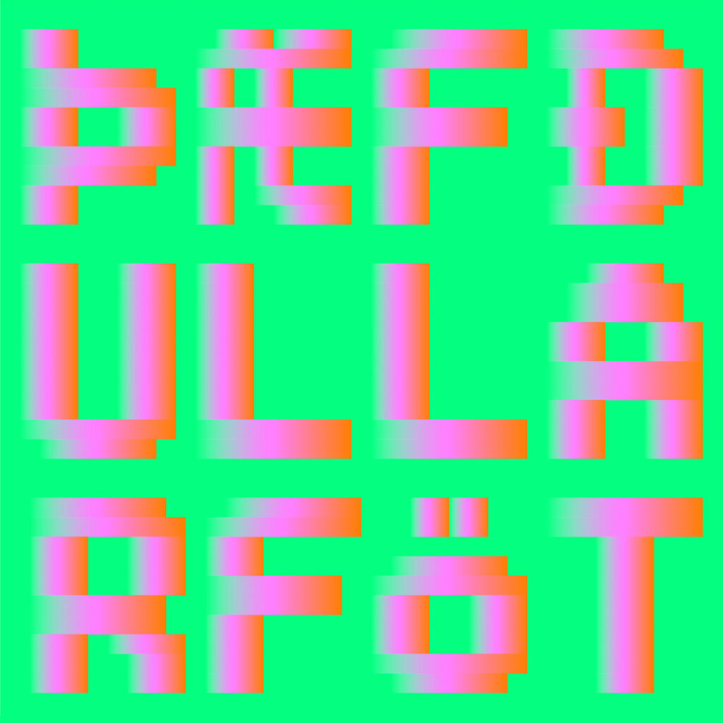
The mono-spaced capital font I made for this project turned into a pet project that I developed a bit further to include the letters of the Icelandic alphabet. The quirky vertical scaling of the accented letters reminded me of typography I saw on Icelandic public busses.
The horizontal gradients that make up the letters suggest a movement that came out nicely in animated sketches. I look forward to exploring this further.